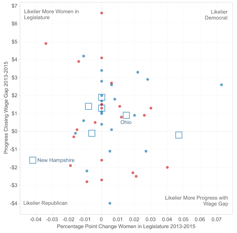
In 2013, Nate Silver observed two interesting correlations involving the Gender Pay Gap: 1) the smaller a state’s pay gap, the more voters in that state voted for Obama in 2012; and 2) the smaller a state’s pay gap, the higher percentage of women in that state’s legislature. The graph below compares Silver’s 2013 data with updated numbers from 2015: the x-axis records the change since 2013 in the representation of women in a state’s legislature; the y-axis records what progress, if any, that state has made in closing the pay gap.
The graph imagines (somewhat whimsically) that these correlations are predictive of future voting patterns. What if having more women in a state's legislature, and a smaller pay gap, led inevitably to that state leaning more toward a Democratic vote in presidential elections?
 2016 swing states (according to Politico): Ohio, New Hampshire, Nevada, Florida, Iowa, Virginia, Colorado. Ohio, with 20 votes in the Electoral College, is more promising for Democrats than the possible loss of New Hampshire, with only 4.
 Color indicates whether a state voted Democratic (blue) or Republican (red) in the 2012 Presidential election. Democrats might want to focus on improving the wage gap in Montana, North Dakota, and Idaho (botom right); and on electing more women to state legislature in Kentucky, Wyoming, and Alaska (top left, top).
 "Predicting Voting Patterns Based Upon Change in Wage Gap and Percent of Women in State Legislatures." See the (slightly more) interactive
version at Tableau Public.
This is my first time using Tableau Public to put work like this on the web. One thing I need to learn more about is placement of Legend information. I don't like the Tableau Public defaults, so I deleted them and put together the modest Legend information above. But I know that's not an ideal solution. Also, trying to embed the Tableau graphic in this webpage didn't work well--it wasn't "responsive." So I just took a screen capture instead, and link out to Tableau Public in the caption (and here).
This project emanates from a course I'm teaching this semester (spring 2016), CIS 245: Information Visualization. It is also a course in our Gender and Women's Studies program, so all the visualizations we're creating have something to do with gender. I'm happy to hear from anyone who'd like to discuss this or similar projects.
Data Sources: 2013 State legislature data, 2015 State legislature data, 2013 earnings ratio data, 2015 earnings ratio data.